The brief
Moss & Co. were paying licence fees for four different fonts that never quite fitted their tone.
The idea
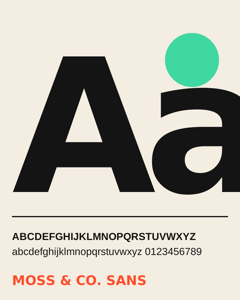
We drew one family in five weights: heavy and friendly for headlines, open and calm for small text. Rounded terminals keep it warm without feeling childish.
Paper#F4EDE1
Ink#141414
Moss#3FD7A2
Accent#FF4D2E
The result
One font, zero licence fees and a brand that finally sounds like itself in every channel.
Got a brief? Let's make it loud.
Tell us what you are making and we will come back within two working days with ideas, a rough plan and an honest quote.
Start a project